Create a clear path from brand discovery to menu browsing and visit planning
Back to work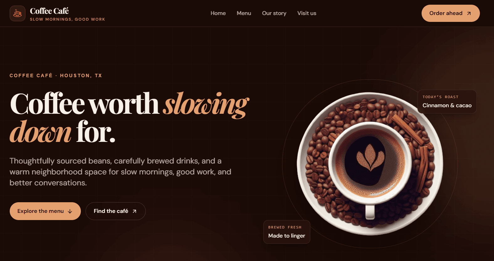
Frontend concept · 2026
Coffee Café
A responsive specialty-coffee concept site that turns a basic landing page into a warmer, more intentional brand experience for menu discovery, café visits, and order-ahead actions.
Coffee Café
4
Core sections
2
Primary CTAs
100%
Responsive
- Role
- UI design & frontend development
- Focus
- Brand hierarchy and responsive conversion flow
- Stack
- React, Vite, Tailwind CSS, AOS
The challenge
A coffee page needs more than an attractive hero.
The original experience had a strong coffee image but little content structure: generic copy, disconnected labels, a fake app download prompt, and no clear path from browsing to visiting the café.
The goal was to create a client-ready concept with a cohesive visual identity and a useful visitor flow. Every section needed to answer a practical question: what is the café, what can I order, why should I care, and how do I visit?
The solution
A considered café experience from first impression to visit.
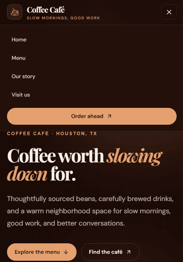
Support desktop and mobile navigation with accessible, touch-friendly controls
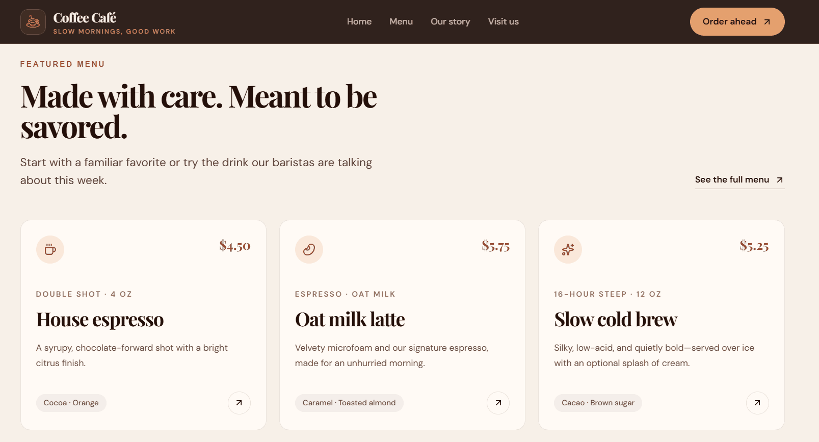
Present featured drinks with structured pricing, descriptions, and tasting notes
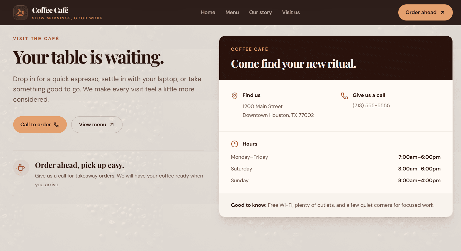
Replace generic content with a cohesive story, practical café information, and clear calls to action
Product walkthrough
Built for desktop browsing and mobile decision-making.
The content hierarchy remains consistent across screen sizes, while the navigation, spacing, and calls to action adapt to the way visitors interact on each device.
Interaction detail
Sticky navigation without layout drift.
The final layout keeps the primary navigation visible while scrolling. Removing overflow control from the header’s ancestor allowed CSS sticky positioning to work as intended.
Technical approach
A lightweight frontend stack focused on responsive polish.
React
Component-based sections for navigation, hero content, menu cards, café story, visit details, testimonials, and footer content.
Vite
A lightweight development and production-build workflow for fast iteration, local previews, and static deployment.
Tailwind CSS
Responsive utility-first styling with shared layout, label, and button patterns to keep the visual system consistent.
AOS
Subtle one-time scroll transitions that add movement without overwhelming the browsing experience, alongside reduced-motion support.
Implementation challenges
Refining the experience without adding unnecessary complexity.
Creating a credible brand system
The original landing page used generic claims and disconnected visual elements. I introduced an espresso, cream, and terracotta palette, paired editorial display type with readable sans-serif text, and wrote content around a single café brand voice.
Improving the content journey
A café visitor should be able to understand the offering and act quickly. I organized the page into a deliberate flow: hero, featured menu, brand story, visit details, guest notes, and contact information.
Making sticky navigation work
The initial page wrapper used overflow handling that prevented the sticky header from attaching to the viewport. I removed overflow control from the header's ancestor and applied horizontal clipping only to the main content area.
What’s next
Ready to evolve from concept to a real café platform.
- Connect the menu to a real CMS or product data source
- Add a dedicated ordering flow or third-party ordering integration
- Replace concept details with verified business location, hours, contact, and social profiles
- Add a map embed, accessibility audit, and performance monitoring before a real launch
Explore more